Creating Smart Layout Components (HStack, VStack, and ZStack)
In today’s Zoom session, I streamed the design and creation process for creating a handful of SwiftUI inspired layout components for G2: HStack, VStack, and ZStack.
These components are designed to enable users to create many layout UI variations with very little code.
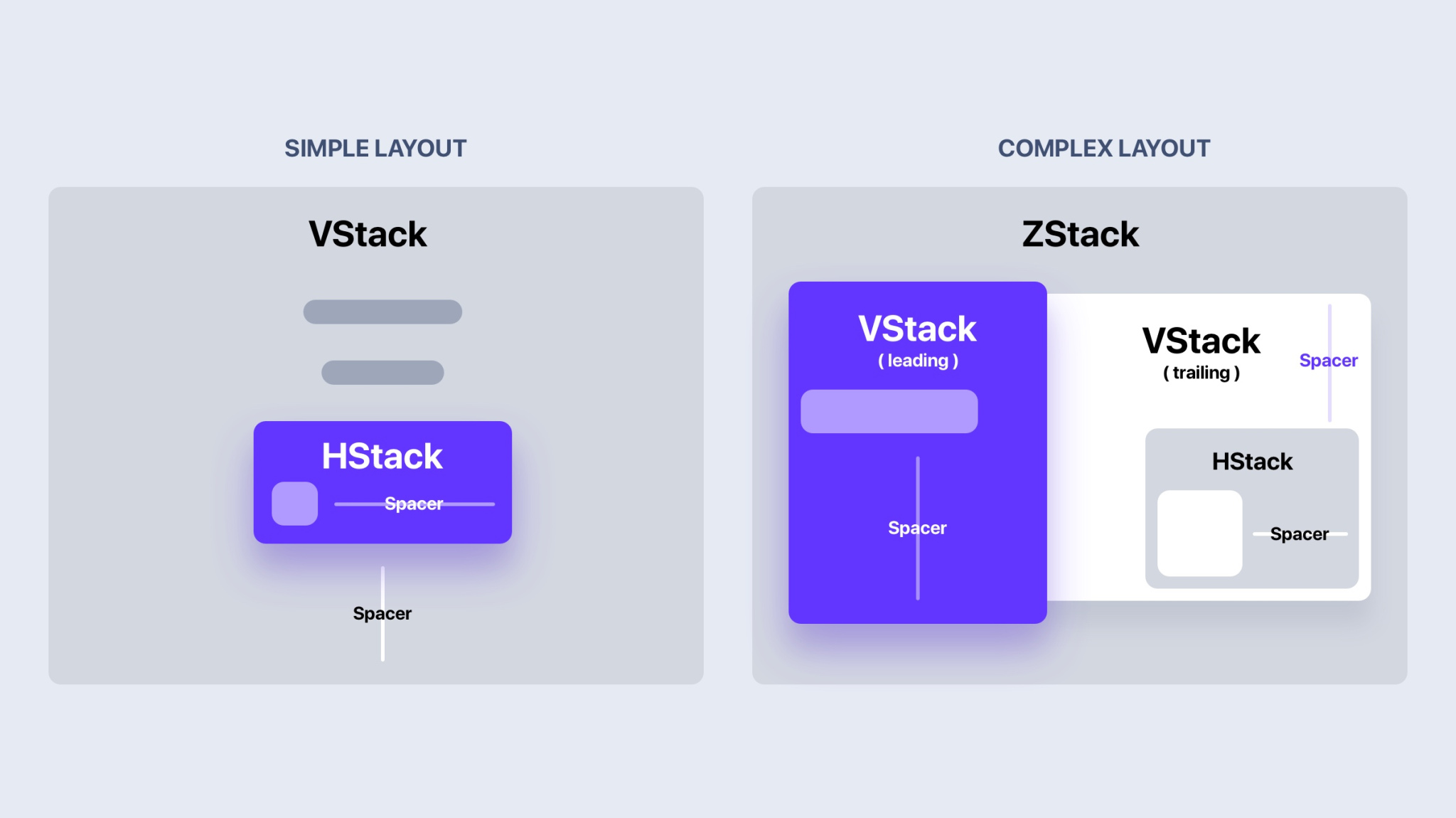
What are these stacks?

(Source: Design+Code)
HStack aligns items in a horizontal fashion.
VStack aligns items in a vertical fashion.
ZStack stacks items in a layered fashion.
Each layout stack component renders with smart defaults to accommodate the most common use-cases for each layout type.
HStack and VStack provide a property called spacing, allowing the user to add (you guessed it) spacing in-between each item as needed.
Combining Stacks
HStack and VStack can be nested and combined! That means you can use VStack with HStack (and vice versa). Once you get use to the automatic layout flow, you’ll start noticing how many (and I mean many) UI designs can be created by using these 2 layout components.
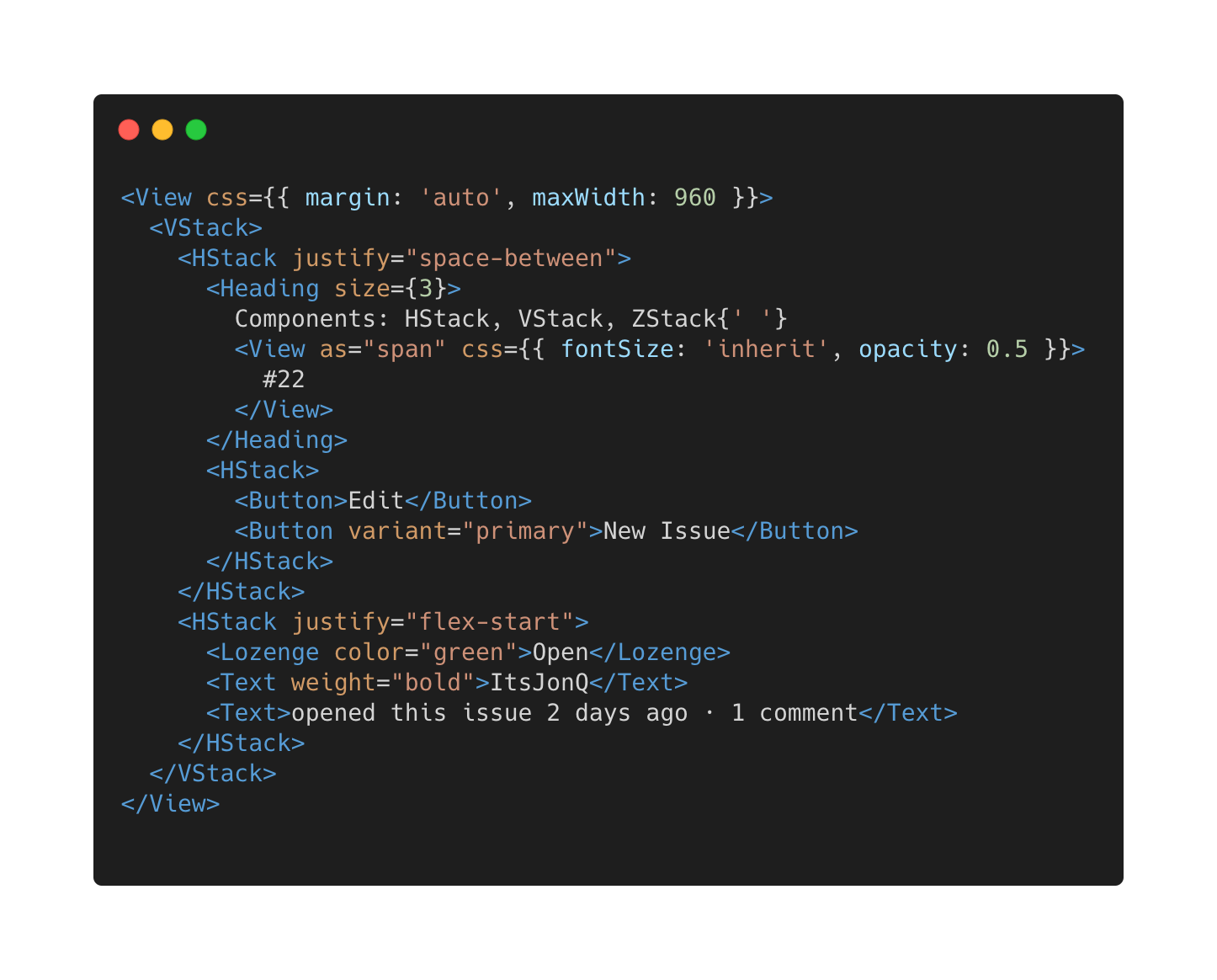
During the Zoom stream, I recreated this header UI from Github using a VStack and HStack:

Here’s the code needed to create this:

(Seriously! That’s all of it!)
The example above uses HStack and VStack, along with other components from the library.
Layering + Animations
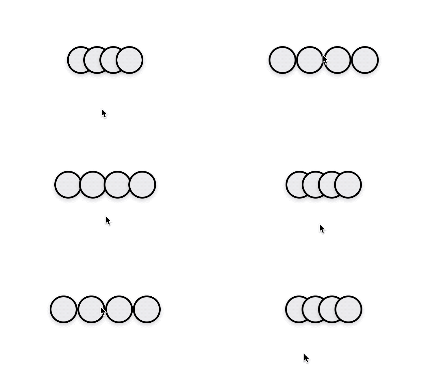
For fun, we attempted to recreate the layered, fanning, animated avatars UI from Github. We ended up with something like this:

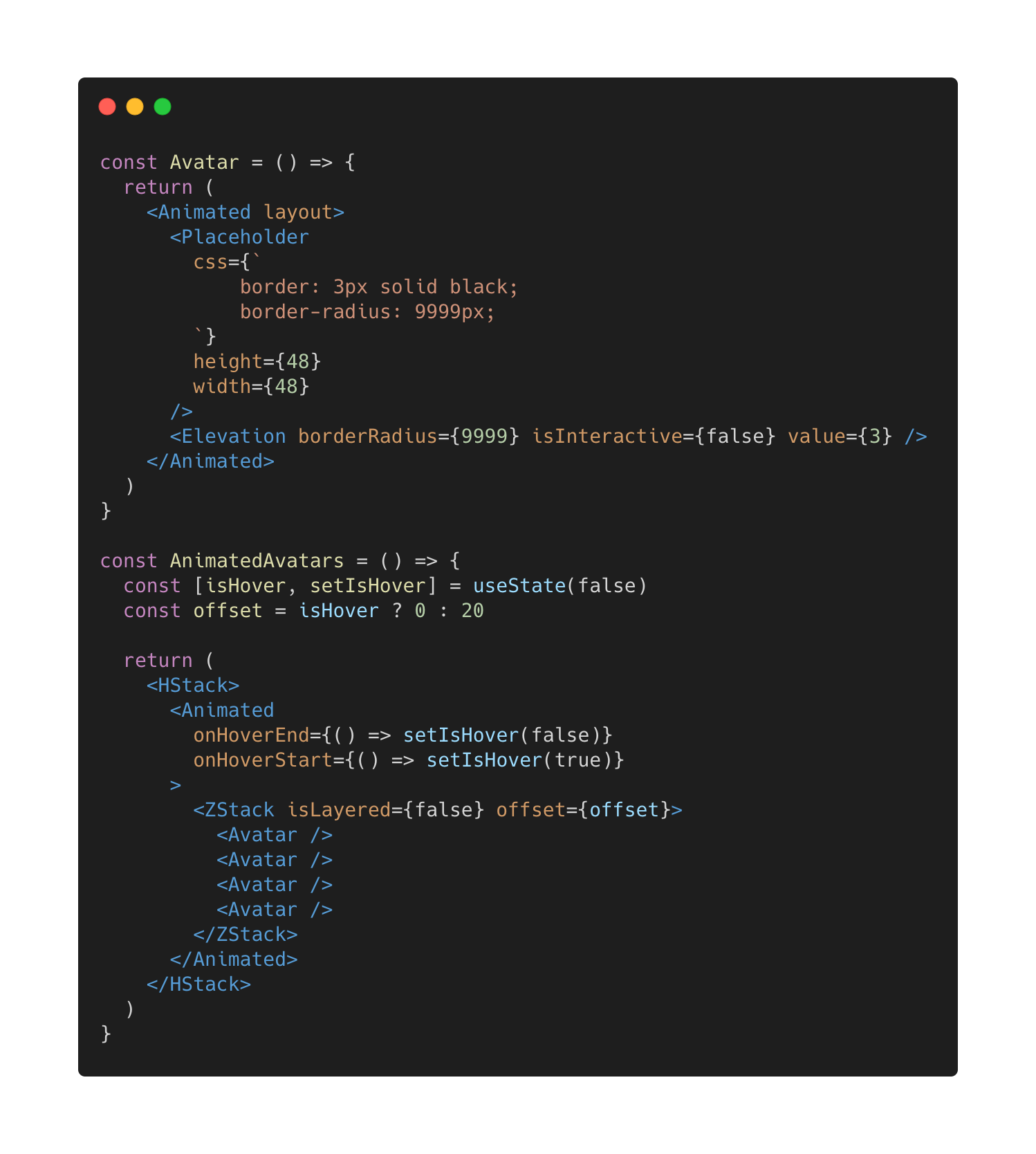
It was incredible to see it come together! Here’s the best part… check out the code:

(Again! Seriously! This is all of it!)
I nerded out when the animations came together. ZStack ordered and layered the inner Avatar components, and the handy Animated component (from the library’s Animation system) took care of the rest!
Do more with less
The layout stack components are key examples of design challenges (layout) can be examined, understood, consolidated, and simplified into a handful of flexible, intelligent, and composable primitives. Enabling and empowering designers and developers to do more with less is the driving force behind everything within this G2 components project.
Video Stream
Below is the recorded video from today’s Zoom session!
Originally posted on the G2 Components project blog.
