Creating a Style System
One of the biggest and most important challenges for the G2 Components project was defining and creating the Style system. The Style system is one of the core system that’s responsible for managing and powering the entire UI layer for the library.
G2’s styles had a handful of truly unique requirements – Features that are often only subtly addressed or even omitted from existing solutions. For this post, I hope to touch upon some of the important mechanics and considerations for the G2 Style system (without drilling down into the possibly boring nitty gritty details).
The requirements for G2 Component’s UI is unlike most projects. Some of the principle requires were:
- It had to work reliably with existing Apps/environments.
- It had to work out-of-the-box (with minimal to zero setup).
- It had to support dark, high-contrast, and Color-blind modes (any of which could be mixed.)
- It had to be portable.
- It had to be fast.
- It had to be easy to use.
On the surface, these requirements don’t seem too unreasonable… but, you’d be surprised! Most styling solutions (yes, even the ones with 10,000+ Github stars) fail at requirement #1. This is because most styling solutions (within the context of React) are crafted to work with newer technologies (e.g. a pure React app) and/or reliable and controlled environments (a closed-source App).
Here’s the thing…
Gutenberg, especially WordPress, are non of those things! They’re the complete opposite of those things! And our Style system has to work with Gutenberg and WordPress.
In order to meet the principle requirements, I had to get creative. I leveraged most of what I could with existing battle-tested technologies, and adopted workflows from various other libraries and disciplines. All with the hopes of crafting a styling experience that felt intuitive (with a low learning curve) and with a majority of the workflow/scaling difficulty gracefully abstracted away.
Creating The “Creator”
It became clear that there were 3 core pieces that made up the Styling system.
- “Configs” – A collection of values used within UI.
- “Compiler” – The thing that managed, compressed, and cached the styles.
- “Renderer” – The thing that worked with the “Configs” and “Compiler” to generate the UI you see on the screen.
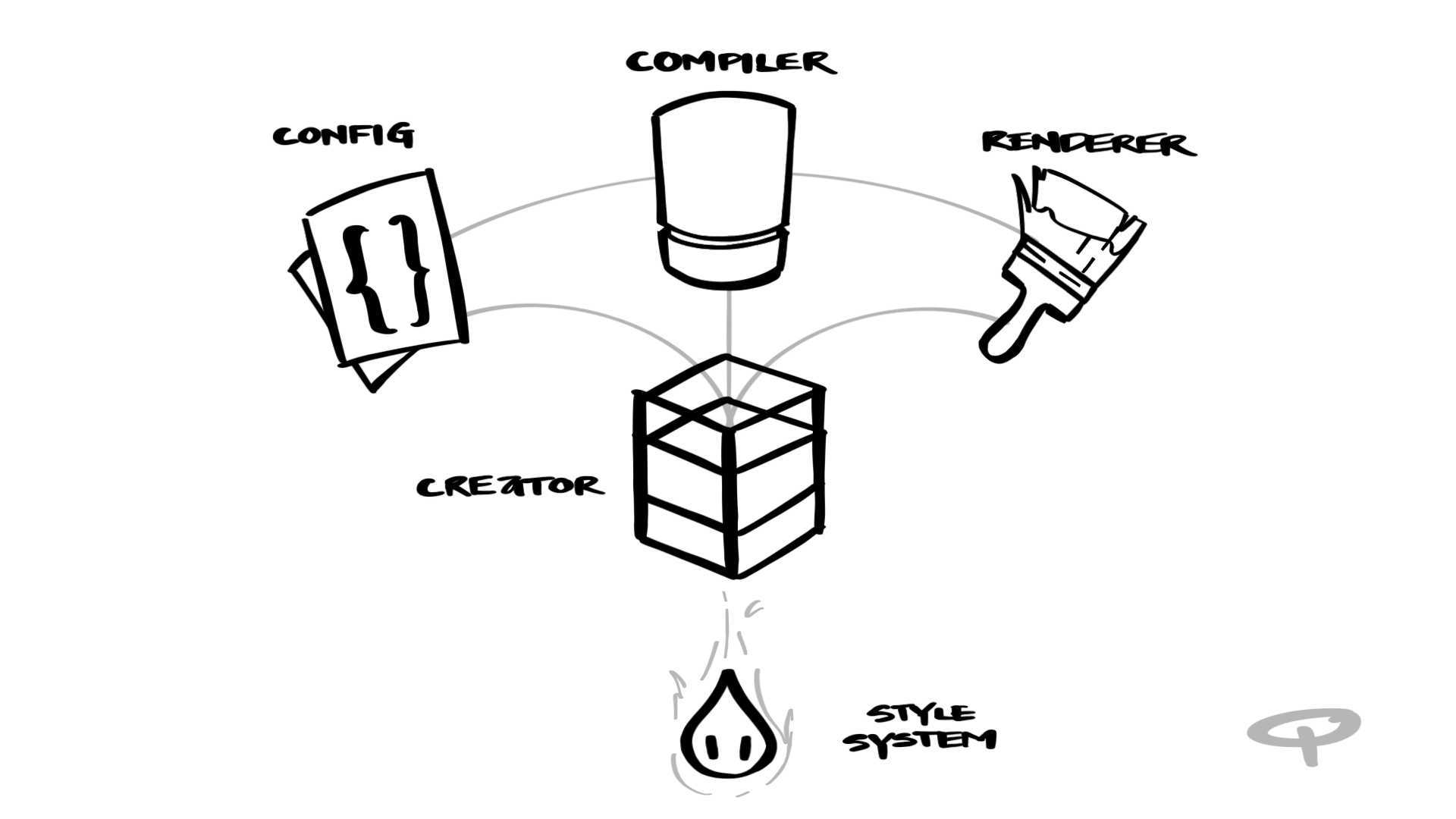
I was then able to create a “Creator” – The thing that combined everything together and built a neatly packaged fully-featured Styling system.
In most cases, this “Creator” isn’t necessary… Unless there’s a case where multiple Style systems need to exist alongside each other – created using G2 Styles or other external Style systems (e.g. Emotion, Styled Components, etc…). Each system with their own set of base styles and their own way of doing things.
This scenario is unlikely, but entirely possible as WordPress Component’s starts venturing beyond Gutenberg and into the plugin-filled world of WP Admin.
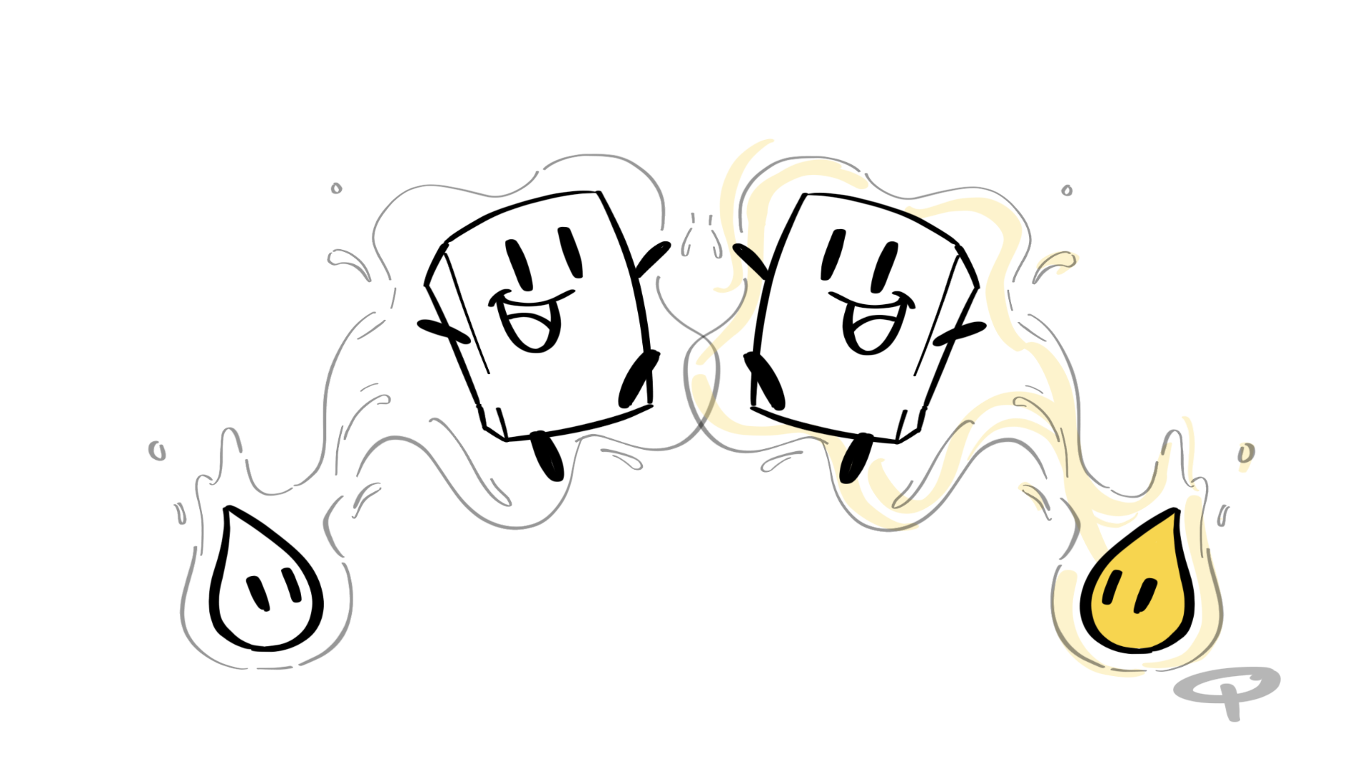
Hypothetical multi-Style systems scenarios aside (which the G2 Style system can totally handle by the way), another benefit of creating this “Create Style Systems” module would be to ease the (code) integration into WordPress Components and Gutenberg.
“Resets”
Right off the bat… A lot of Styling systems fall due to their (sometimes naive) reliance on some sort of global CSS “reset” or “normalization”. Things ranging from box-sizing: border-box to input normalization or margin-zero’ing. The entire library/framework is then built on the assumption that these resets exist (and are not tampered with!). Explosions happen when a Style system attempts to inject their own global resets, which may break the existing App. The App then needs to “reset” the reset styles, which spawns a circular override cycle of CSS pain.
If we wanted to create a Styling system that is both portable and can integrate into (basically almost) anything, we therefore cannot rely on the existence of CSS resets.
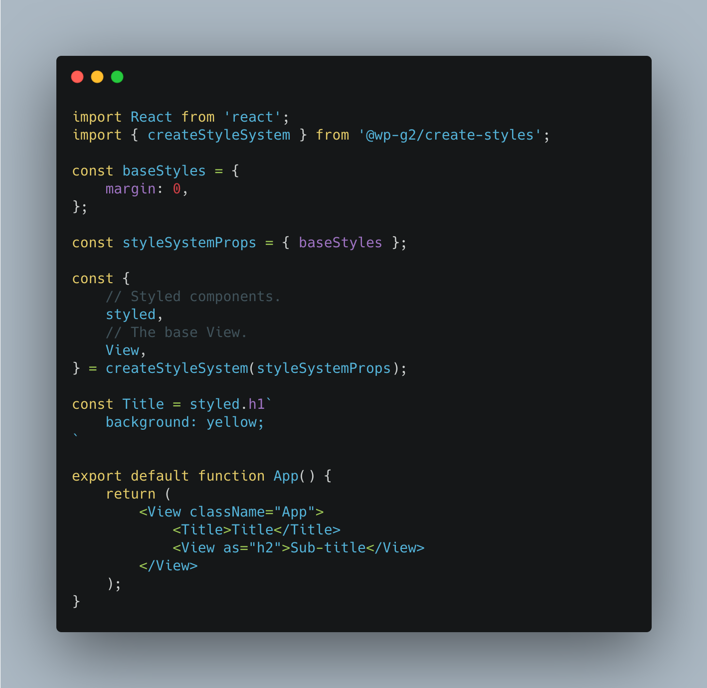
G2’s Style System allows you to define resets (aka baseStyles) you’d like to use as an option in the “Creator”. Once the Style system is made, every component related style generated from the Style system (CSS wise) will have these “resets” built-in. In other words, the UI components will have zero external CSS dependencies from the outside environment. As far as resets go…
The environment is shield from it, and it is shielded from the environment.
Near Zero Conflict
The classNames that the Style system outputs are uniquely hashed which greatly reduce the chances of conflict from existing style rules. This feature isn’t unique for this G2. In fact, it’s an expected defacto feature for CSS-in-JS based solution (from Lineria to Emotion). What is special about G2’s Style System is that it cleverly compounds the classNames (to the power of 7 by default), resulting in CSS output that looks like this:
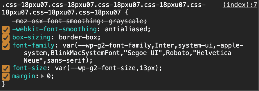
This compounding greatly increases the specificity of the generated styles, making them more reliable when integrating into environments with existing and/or older CSS style rules. It’s not perfect though, as existing #id / !important styles will still win the CSS specificity battle (bummer).
It is worth noting that the compiled CSS classNames are not meant to be human readable. It’s worth noting that having human readable HTML is an important (but often omitted) use-case in developing, designing, and debugging. To handle this, the G2 Components uses the Component’s name and adds within the class attribute and a special data-g2-component attribute (via the Context system)
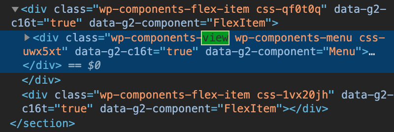
It’s worth noting that className hashing, compounding, and HTML attribute identification happens seamlessly and automatically. You, as a Designer/Developer, do not have to do anything. The Style system takes care of it for you.
Variables
Another vital part of the styling experience is how variables are managed, retrieved, and rendered. The G2 Style system accepts variables (object) for:
config: Regular ol’ variables.darkModeConfig: Variables for dark mode.highContrastModeConfig: Variables for high contrast mode.darkHighContrastModeConfig: Variables for dark + high contrast mode. Values from these configs are automatically retrieved and rendered based on what mode the Style system is in (e.g. Dark mode). That means that the UI Components don’t have to manage “mode” logic. They just need to use the variables. The Style system takes care of the rest.
These variables are eventually transformed and compiled into CSS variables, with automatic CSS variable fallback for IE11.
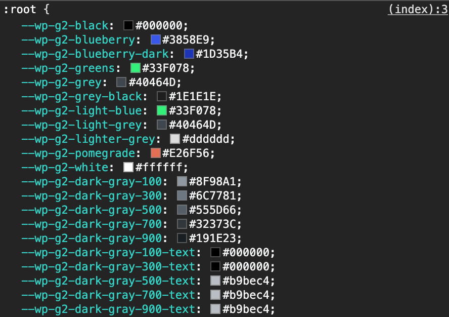
Without getting into too much detail… The eventual compiling into CSS variables is important for performance and scoping. An example of scoping that can be achieved is to render a section of UI in an alternate mode or with custom variables.
In the example (below), to achieve a dark Sidebar UI, we’re actually just rendering the sidebar in “Dark mode”. Nothing else! The inner components know how to adjust accordingly – all without it’s “Dark mode” effects bleeding out to other sections.

Incremental Integration
As mentioned earlier in this post, integration into existing environments is incredibly challenging and is where most styling solutions fall apart. The above mentioned features such as className hashing, compounding, variable management, “mode” detection, scoping, (and more) are designed to work in concert to seamlessly integrate into the existing App environment that is Gutenberg, WP Admin, and potentially beyond. Not only that, but the Style system was designed in a way where we’ll be able to incrementally upgrade UI components – bit by bit, block by block, section by section. This is the only realistic way that this will work.
Example
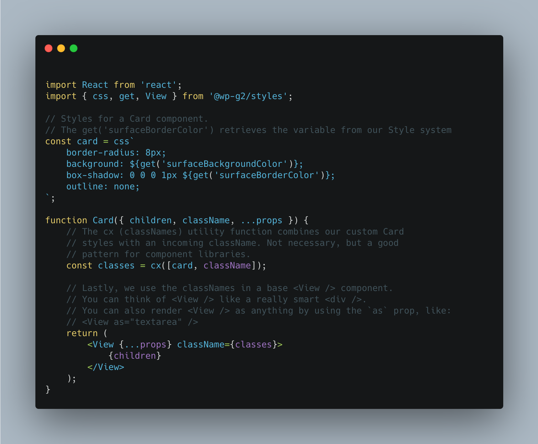 Above is an example for how a styled Card component could be made using the G2 Style system. The real thing varies slightly compared to what’s shown above, but the workflow is similar. There are various ways in which components can be styled and modified – perhaps something for a future post!
Here’s the live code example!
In Conclusion
 There was a lot of thought put into addressing the principle requirements in designing the G2 Style system. One requirement stood above the others (at least for me):
It had to be easy to use.
Plain and simple.
Adding and maintaining styles for a large project is frighteningly difficult. The amount of context and architecture knowledge required to make seemingly simple style changes is often too high. This leads to increasingly unpredictable experiences (for the end-users) with compounding difficulty for contributors. G2’s Styling system paid special attention to this and attempted to automate away the difficult parts of working with UI styles.
Without having to worry about adverse CSS side-effects or details like variable compilation… Contributors can (hopefully) have more mental and creative capacity to focus on crafting the best UI experiences they can.
If you’re curious about the “Create Style System” code, check it out on Github! Results from the G2 Style system can be seen on the new G2 Documentation site.
Thank you so much for your time today! This was a long one ✌️.
Originally posted on the G2 Components project blog.
