Core Systems for Components
For years now, I’ve been thinking very deeply about design systems, with a focus on UI / component libraries.
Based on my experience, I believe that a lot of the UI related pain felt by designers, developers, and other contributors, are due to an underdevelopment or even an absence of very important and often under-estimated core UI systems.
Given the context of Gutenberg and the web, it is worth pointing out that working on an application/platform is very different compared to working on a website. The underlying web technologies may be the same (HTML, CSS, JS). The difference is how these technologies come together, especially considering factors like scale (how many people work on it) and longevity (backwards compatibility + legacy support). One way of looking at it is…You probably wouldn’t build, say, Mac OS the same way you would build a restaurant landing page.
With that being said, the goal of this experimental component library (or any component library) isn’t to craft the most elegantly engineered system-obsessed chunk of code. Far from!
These core systems should feel invisible to folks using the library – kind of like an automatic transmission for a car. They exist for the primary goal of providing the best user experience possible – allowing users to do more with less.
Identifying the systems

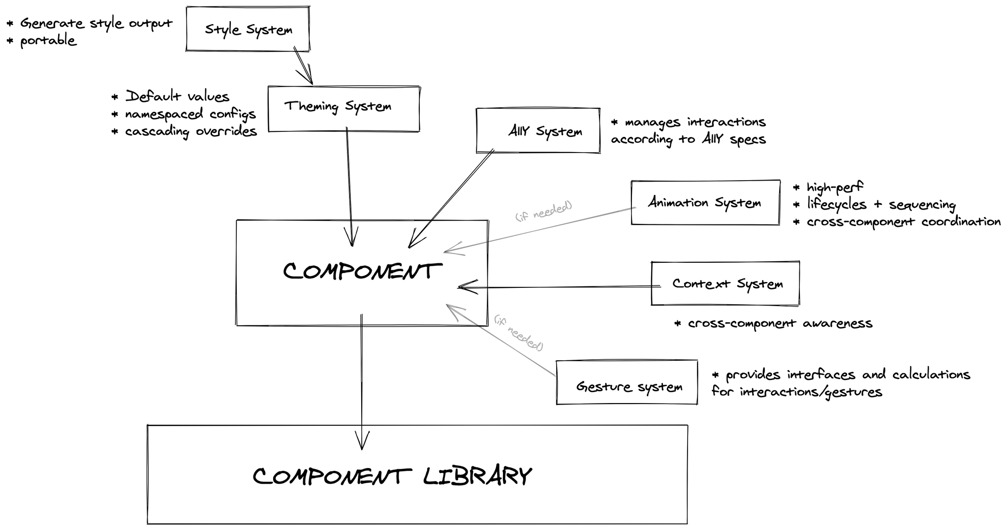
Above is a rough diagram that outlines the various core systems (at a high level):
- Styling (and theming/customization)
- Accessibility
- Context
- Animations (and gestures)
I’m going to touch upon important aspects of each system. The choice of technologies is not nearly as important as the problem each system is attempting to solve.
I’m going to be using the term “end-user” to describe users of the product (e.g. someone using Gutenberg to create a post). I’m also going to be using the term “user” or “consumer” to describe contributors/developers working with the library (e.g. a 3rd-party block developer using the library to construct their block controls).
Styling
Styles is probably the most painful aspect when it comes to creating and using component libraries. It’s deficiencies are also the most obvious! End-users can easily spot when text is accidentally rendered 20px too large or button colours are mismatched.
From an integration perspective, consumers of this library, whether it’s Gutenberg core or 3rd party block/plugin developers, should be able to proceed with the complete confidence knowing that existing styles (e.g. Gutenberg or WP Admin) will not be broken. Not only that, component styles will look and behave as advertised. All of this, without the consumer having to do anything!
The best way to achieve this is to have a robust, flexible, and high performant style system that’s specifically designed to be integrated into environments with existing and older styles. This last point is incredibly important as many styling systems do not prioritize or support this requirement.
Accessibility (A11Y)
There’s so many aspects to accessibility. Personally, I’m learning more and more about it everyday, especially as I work through adding core support for features like built-in improved color blind support. It’s vastness and nuance means that it’s difficult for individual developers and designers to have total awareness as they create user interfaces.
The library should have a11y considerations built right into every single one of it’s components. This both alleviates overhead for developers and sets high quality baseline for a11y considerations throughout the platform.
Context
Context provides “awareness” for components. Their aesthetics and behaviours can be adjusted depending on where they live or how they’re put together. A great and common example would be how Buttons should know how to automatically round/straighten their corners would combined together within a ButtonGroup.
This self, sibling, and parental awareness should be built into applicable components, saving the consumer from having to manually manage or string things together.
Animations
Animations are hard. Really hard. These complexities are often felt by developers when trying to wrestle various settings and states together. It’s made more difficult when animations can be influenced or cancelled based on external state changes.
I’ve shared some of my thoughts on Animation systems in this Github post.
Having a feature-rich, high performant, composable, and most importantly, simple (to code) Animation system bring the UI to life. Purposeful animations can better communicate intention and flows to users. Animations being part of core means that they can be used more easily and more often. More importantly, animations can be actively disabled (system wide) based on user preference or a11y needs.
System Flow
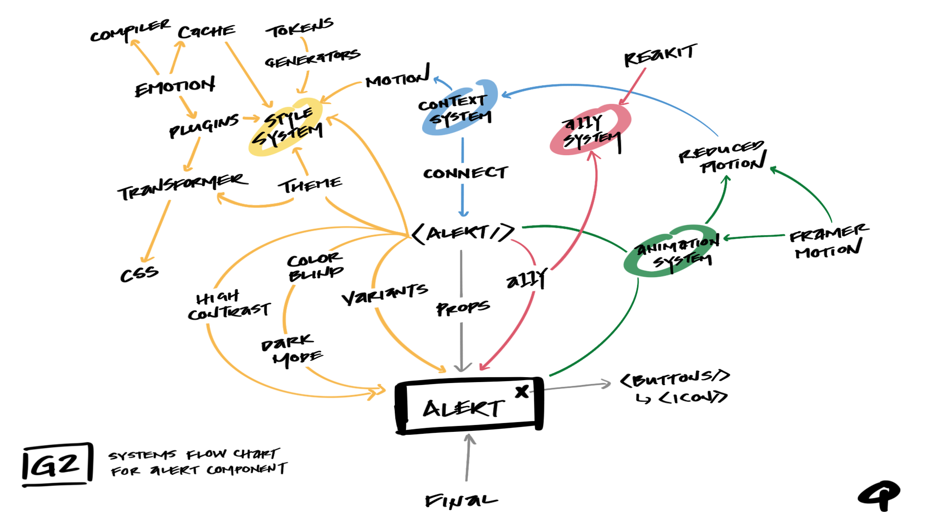
With Style, Context, A11y, and Animation systems identified, let’s see how they work together.
Above is a flow chart illustration, detailing the various systems and mechanics for an Alert component. The good news is, most consumers/users would only ever have to work with this:

How animations are sequenced, how styles are compiled, how cross-component communication is coordinated, and how a11y-adjusted events are orchestrated… all are handled for you by the core systems of the library.
In Conclusion
As cool as all this systems stuff is… I would prefer not to have to deal with it (Haha, I’m being honest!). I (like many of you) just want to built cool stuff. I just want to create fun interfaces and experiences without having to think about 37 architectural considerations or think though the 14 ways CSS could break.
That being said, I recognize that many layers of systems have to exist in order to support this workflow. A workflow with a diverse feature-rich set of building blocks. A workflow that alleviates overhead, empowering designers and developers to be creative. A workflow that enables us to craft the best user experiences – to create more with less.
Originally posted on the G2 Components project blog.
